To this end, the firm has been improving print quality while reducing costs. At the heart of that process is the adoption of FM screening, which, despite a chequered history and reputation for being unwieldy to work with, is paying dividends.
Production director Smith had been keeping an eye on FM screening since the early 1990s, but it was a demanding client that pushed the firm to experiment with the process.
“We had a client that was very concerned about image quality and resolution,” he says. “We decided to try FM and we could find no negatives.”
That was three years ago, shortly after Smith joined Ash and Killmurray to add litho production experience to the business, which until then had specialised in digital print and pre-press.
“I was fed up because the quality and consistency of the print I was subbing out was poor,” says Killmurray. “I knew Fenton of old and heard he was going to set up on his own. We had the clients and we knew his work was excellent.”
Three months later, in November 2004, Smith was on board and the firm had installed a six-colour Heidelberg Speedmaster CD74 perfector plus coater.
“We’ve been using FM pretty much since we started with litho three years ago,” says Smith. “We didn’t tell people and lots of clients did comment that our print was really nice, but couldn’t place why.”
The firm decided that it needed to promote itself and the benefits that FM could bring to its customers. Last November, following the launch of a brochure – that won agency Hat-Trick Design a Design Week award – and a new website, it launched its tint book, attracting 140 designers and print buyers to the Bridewell Institute, London. The book was designed by agency HGV and its production supported by James McNaughton Paper and Heidelberg. It illustrates how the firm can bring an edge to high-quality design, with multiple spot colours, at the price of four-colour process.
“If you’re on a tight budget and thought you couldn’t afford special colours, well, now you can,” says Smith. “If you haven’t got a lot of money you can still be very creative.”
By sticking to four colours and picking tints, clients can eliminate a lot of the problems associated with working on uncoated stocks, such as picking. Boss believes it has found the silver lining to the dark clouds of the current economic climate. “More people are worrying about money: that they won’t be able to afford to use special colours,” says Smith.
It’s not just in the print itself where Boss’ attention to detail stands out. While getting to grips with FM, Smith was also working on using drip coating, to produce techniques that combine spot and flood coats to great effect, and bolstering its post-press with a platen and case-binding to produce some stunning jobs.
Kilmurray describes its target market as highly creative design work and it is clear from the samples on show that it can deliver on its clients’ creativity with this approach. As for his aim, when bringing Smith on board, to take litho print in-house because other printers couldn’t meet the firm’s quality requirements, the samples tell their own story, as Smith says: “We don’t tab off file copies.”
Boss reveals secrets of its FM success
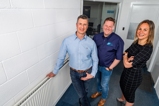
Joe Killmurray, one of the directors of Acton-based B2 printer Boss, was told that the firm shouldnt have picked that name: surely the client ought to be boss, not the printer. Nevertheless, the firm takes client relations very seriously, even if Killmurray and fellow directors Phil Ash and Fenton Smith who prefer to go by the titles of gopher, janitor and tea boy respectively dont take themselves too seriously.


